Volatility Skew
The market charges more for fear
Downside protection almost always costs more than at-the-money. Skew measures exactly how much more, and whether today’s reading is unusual.
Five deltas · Seven expirations · A year of context
The smile
One stock, one expiration, five different volatilities.
Implied volatility isn’t a single number. It changes with every strike.
Protection against a crash is permanently bid, so the left wing towers. The three measures read the 25-delta wings — the deep tails show up only here.
The measures
Three ways to put a number on it.
Each one a percentage of at-the-money implied vol, so a quiet mega-cap and a volatile small-cap compare directly.
Put skew
What protection costs
The 25-delta put over at-the-money. The more positive it runs, the harder hedging demand is bidding downside.
Call skew
The one with the awkward sign
At-the-money over the 25-delta call — so positive means calls are cheap, and a falling reading means they are getting bid.
Risk reversal
The whole tilt, one number
Put wing against call wing. The standard gauge of how lopsided demand has gone between fear and greed.
Context
Is that a lot, for this stock?
A tilt only means something next to the tilts the same name has been printing all year.
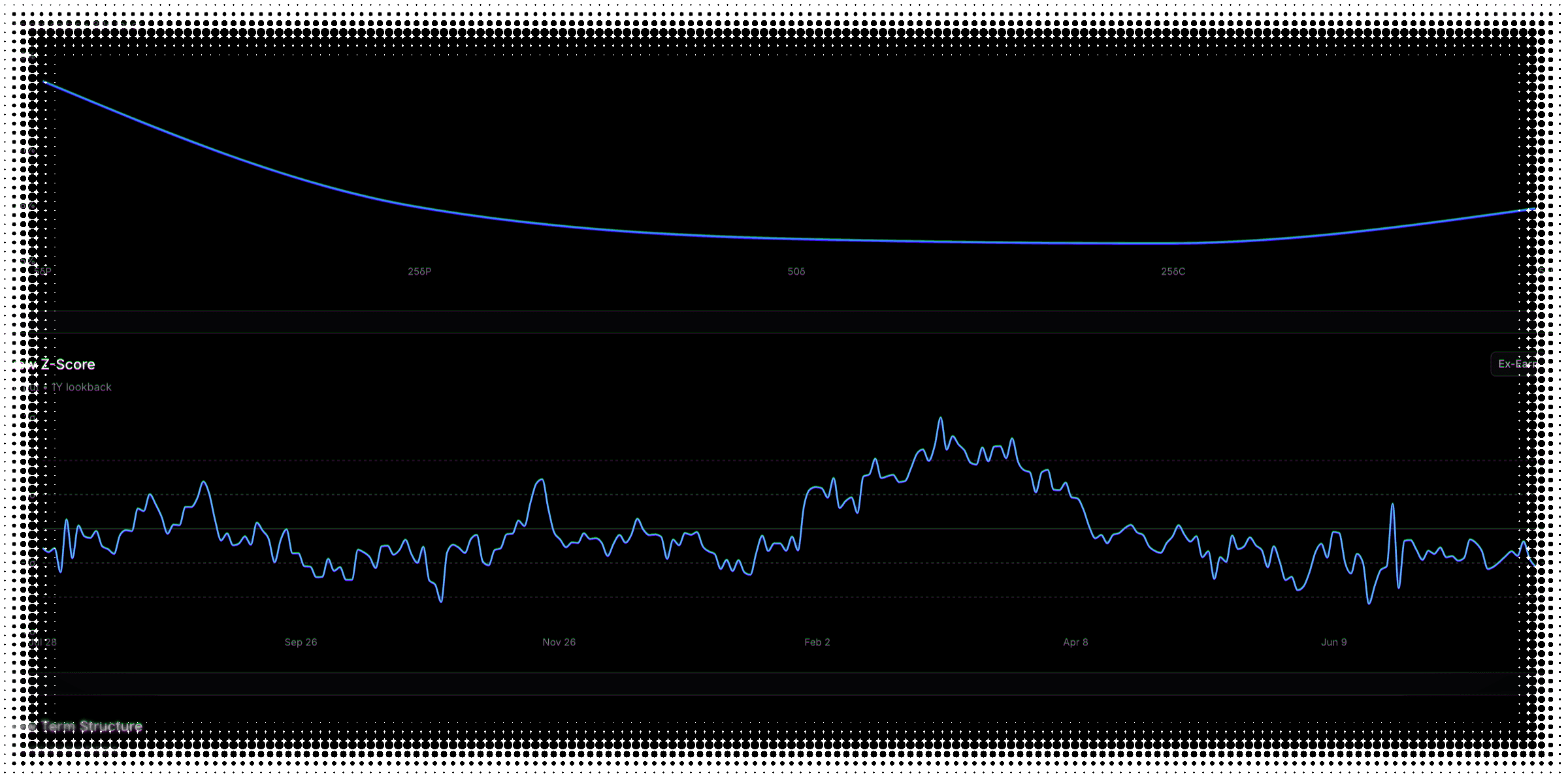
Z-score
How far from normal
Today against the stock’s own year, in standard deviations — so you can tell an unusual reading from a busy one.
Percentile and rank
Where it sits in the range
Percentile counts the days below today. Rank measures the gap between the year’s low and high. One view at a time.
Across expirations
The tilt has a term structure of its own.
Skew is rarely the same shape at ten days and at a year — and where it steepens is information.
Usually richest in the near expirations — a shock next month barely dents an option with a year to run. Only the 30-day reading carries history.
This is the tilt across expirations. For the level of implied volatility across them, see Term Structure — and for what the market is charging at the money, Implied Volatility.
Volatility skew FAQ
What to know about reading the smile
Skew is the fact that options on the same stock, with the same expiration, trade at different implied volatilities depending on the strike. In equities, out-of-the-money puts almost always carry higher implied volatility than at-the-money options, because protection against a crash is in constant demand. Skew measures how big that gap is.
The smile is skew drawn as a curve. Plot implied volatility across five strikes — from the 5-delta put through at-the-money to the 5-delta call — and you get a shape that in equities is usually far higher on the left than the right. That lopsidedness is why traders often call the equity version a smirk rather than a smile. You can read it at any one of seven expirations, or switch to the all-tenors view and see all seven curves overlaid on one chart.
Put skew is the 25-delta put’s implied volatility above at-the-money. Call skew is at-the-money above the 25-delta call. Risk reversal is the put wing minus the call wing — the tilt of the whole curve in one number. All three are available at every expiration from ten days out to a year, one measure at a time on each chart; the stats bar is where all three readings sit together as numbers.
Because a raw gap in volatility points is not comparable between stocks. Five points of skew on a name running 15% implied volatility is a dramatic tilt; the same five points on a name running 80% is barely a lean. Dividing by at-the-money implied volatility turns each measure into a relative figure, so a quiet mega-cap and a volatile small-cap can sit in the same screen and mean the same thing. Every skew number on this page is a percentage of at-the-money, not a difference in volatility points.
Because of the direction of the subtraction. Call skew is at-the-money implied volatility minus the 25-delta call, so the number grows as the call falls further below at-the-money — a high reading means upside is cheap. It runs the opposite way to put skew, where a high reading means puts are expensive. The practical consequence catches people out: call skew falling is calls being bid, which is usually the more interesting event. It is worth reading the sign deliberately the first few times.
It is the implied volatility of the 25-delta put minus that of the 25-delta call, expressed here as a percentage of at-the-money. It is the standard market gauge of how lopsided demand has become: a large positive number means downside protection is being paid up for relative to upside, and a number near zero means the two wings are priced about evenly. Because it nets the two sides against each other, it moves when the balance of demand shifts rather than when overall volatility rises and falls.
High put skew or risk reversal means downside protection is richly priced relative to at-the-money — fear is bid. Flat or negative readings mean the opposite. Skew tends to mean-revert, so extremes often fade, but these are relative gauges: they tell you how today compares with the past year for this stock, not where skew is heading next.
Yes, and often substantially. The tilt is usually richest in the near expirations and flattens as you look further out, because a shock in the next few weeks matters far more to a short-dated option than to one with a year to run. The term-structure view plots your chosen measure at all seven expirations at once, so you can see whether today’s tilt is concentrated in the front or runs the length of the curve. Note this is skew across expirations — the level of implied volatility across expirations is a separate view, on the Term Structure tab.
Three ways, all measured against the same stock’s own past year. The z-score says how many standard deviations today sits from its average, plotted against reference bands at one and two. Percentile says what share of the past year came in below today. Rank says where today sits between the year’s lowest and highest readings — which can differ sharply from percentile, because one old extreme stretches the range without moving the count. One caveat worth knowing: these historical views cover the 30-day reading. The smile and the term structure are snapshots of today.
An upcoming earnings report distorts the near-dated part of the curve, which can make skew look unusual when it is only pricing a known event. The ex-earnings view strips that event component out of the 30-day readings, leaving the shape underneath. It covers the smile and the historical views, at the 30-day tenor, for stocks only — ETFs do not report earnings, so the control does not appear for them. The headline stat cards always show the standard reading.
Roughly five hundred of the most liquid US stocks, plus major ETFs — the same universe the rest of the platform analyses. Everything on this page works for both; the one exception is the ex-earnings view, which is stocks-only because ETFs do not report earnings. If a symbol is not in the universe the page says so rather than showing you a half-populated chart.
No — deliberately end-of-day. The smile, the three measures, and the historical context behind them are all computed once the market closes. Skew is a structural feature of how a name is priced, and the dislocations worth trading in it play out over days and weeks rather than ticks. If a trade only works on a live feed, it is not the kind of trade this page is for.
Still have questions? Contact support
See what the market is really pricing.
We're getting ready to launch. Join the list and you'll be first in the door.