Implied Volatility
Know when options are actually expensive
What the market is charging, read across the whole chain and set against the stock's own history.
Model-free and ATM · Ex-earnings views · ~4 years of context
Reading the chain
A number is not a reading.
Which strikes, which horizon, and how today compares to this stock's own year.
Basis
One chain, two readings
ATM prices the 50-delta strike. Model-free blends the whole chain, so it also catches what traders pay for the tails.
Tenor
Seven constant maturities
Ten days to a year, on either basis, with or without earnings — twenty-eight series per name, one at a time.
Context
Percentile and rank disagree
One old spike stretches the range and drags rank down while percentile holds. The stats bar carries both.
Range
Expensive, or just expensive-looking?
Cones put today's whole curve against four years of the stock's own implied range.
Wide at ten days, narrow at a year — short-dated options reprice around events, a year of expectation barely moves.
Ex-earnings
Take the event out of the price.
A report inflates implied volatility. Strip that premium and see the baseline underneath.
Comparison
Against what the stock delivers.
Rich only means anything next to the volatility actually being realized.
The ratio
Implied over realized
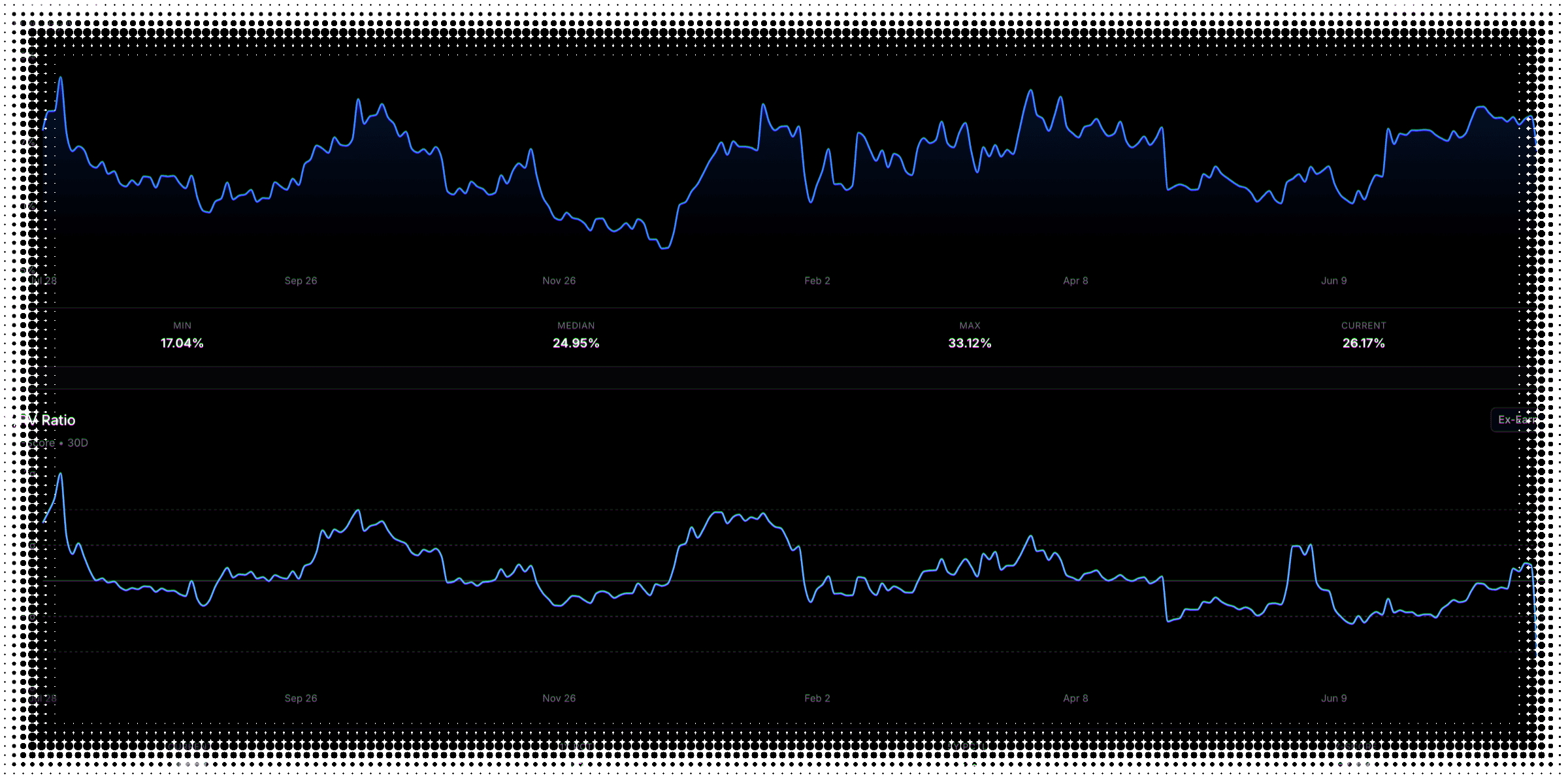
Thirty-day implied against Yang-Zhang realized. Above one, the market is charging more than the stock has delivered.
The context
Read in standard deviations
The chart plots how far that ratio sits from its own one-year average, so you can tell unusual from ordinary.
The realized half of that comparison — measured eight ways, with the earnings days stripped out — lives in Historical Volatility.
Implied volatility FAQ
What to know about reading the option chain
Implied volatility is the market’s expectation of movement, backed out of option prices — how much a stock is priced to move between now and expiration. It is the biggest single driver of what an option costs, which makes it the number that decides whether premium is worth selling.
Model-free implied volatility applies the variance-swap methodology behind the CBOE’s volatility index to a single stock. Rather than reading one strike, it integrates across the listed chain, so demand for far-out-of-the-money options shows up in the number. On this tab it is charted at every tenor, and carried as a current reading at thirty days.
ATM reads a single point — the at-the-money strike, interpolated to 50 delta — so it tells you what a typical option costs. Model-free blends the whole strike chain, so it also reflects what traders are paying for the tails. The two usually differ, and the size of that gap is itself information. The basis is a toggle on the implied-volatility time series; everything else on the tab — the cones, percentile, rank, and the comparison against realized volatility — is ATM.
Historical volatility, also called realized volatility, is what a stock actually did, measured from its past prices. Implied volatility is what the options market expects it to do next, inferred from option prices. Premium selling lives on the gap between the two: you are paid the implied number and you carry the realized one.
IV percentile asks how often implied volatility was lower than it is today, over the past year. IV rank asks where today sits between the year’s low and high. They can diverge sharply — a single past spike stretches the range and drags rank toward zero while percentile barely moves — and on roughly two covered names in five they differ by more than ten points. Both are shown together in the stats bar; the history chart plots one at a time.
An upcoming report inflates implied volatility, which can make options look rich when they are only pricing a known event. The ex-earnings view estimates that event component from the term structure and removes it, leaving the stock’s baseline. Note this is a different operation from ex-earnings realized volatility, which simply drops earnings-day returns — here nothing is deleted, a level comes down. It is available on every chart on the tab, for stocks only, and it moves the reading materially on more than four in five covered stocks.
A cone shows the historical range of implied volatility — maximum, 75th percentile, 25th percentile and minimum — across all seven tenors at once, built from about four years of daily data, with today’s curve plotted on top. Cones are wide at short tenors and narrow at long ones, because short-dated options reprice hard around events while a year of expected movement barely moves. The cones are ATM-based, and a median is computed but deliberately not drawn.
Listed options expire on fixed dates, so the time to expiry of any given contract shrinks every day. A constant-maturity series interpolates between listed expirations to hold the horizon fixed — a 30-day reading is always 30 days out, which is what makes today comparable with last year. One honest caveat: where a name has no listed expiry near a horizon, adjacent tenors can carry the same value, so the seven readings are not always seven independent points.
It divides implied volatility by the realized volatility the stock has actually delivered — specifically Yang-Zhang realized vol — over a thirty, sixty or ninety-day window. A ratio above one means the market is charging more than the stock has been delivering, which is the setup premium sellers look for. The chart beneath plots that ratio on a different scale: its distance from its own one-year average, in standard deviations, so you can tell a genuinely unusual reading from a normal one for that name.
No. Percentile and rank are descriptive — they tell you where today sits in a stock’s own recent history, not whether the premium is worth the risk. Implied volatility is often high for a reason that has not shown up in the price yet, and a reading in the 90th percentile before a binary event is not the same trade as one in a quiet week. These numbers narrow the search; they do not make the decision.
Roughly five hundred of the most liquid US stocks, plus major ETFs — the same universe the rest of the platform analyses. Everything on this page works for both; the one exception is the ex-earnings views, which are stocks-only because ETFs do not report earnings. If a symbol is not in the universe the page says so rather than showing you a half-populated chart.
No — deliberately end-of-day. Implied volatility, the cones, percentile, rank and the comparison against realized volatility are all computed once the market closes. The edges this page helps you find are structural, measured in days and weeks rather than ticks. If a trade only works on a live feed, it is not the kind of trade this page is for.
Still have questions? Contact support
See what the market is really charging.
We're getting ready to launch. Join the list and you'll be first in the door.