Portfolio Performance
The return you actually made
Connect your brokerage and get the numbers a fund would report — time-weighted returns, drawdowns and risk-adjusted ratios, benchmarked against the S&P 500 and updated every day.
Time-weighted returns · 10 detailed metrics · Updated daily
The math
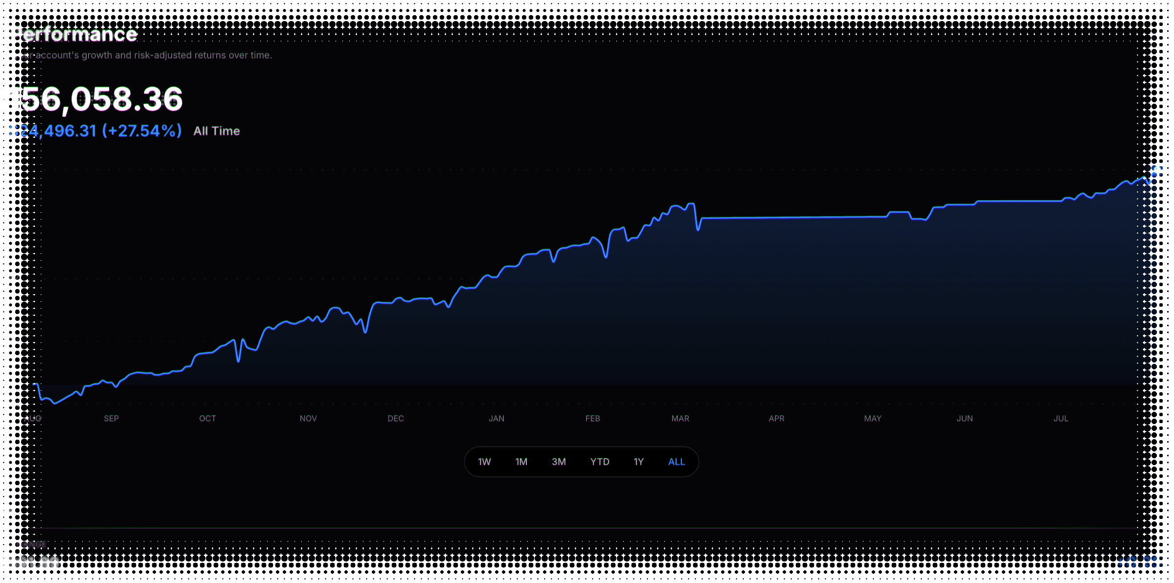
Deposits are not gains
Most P&L trackers flatter you. Time-weighted return removes the flattery.
Wire in fifty thousand dollars and the balance jumps. The return is measured on the capital at work, so it runs straight through.
The record
Two numbers your statement won't give you
A brokerage tells you what you have. Neither of these is there.
The ride
Same finish, different year
Two accounts can end level and score far apart. That gap is what the three ratios are for.
The mix
Winning often isn’t winning big
Win rate counts your good days. Profit factor weighs them. The table carries both, because they disagree.
Brokers
Read-only, encrypted, automatic
A tracker you update by hand becomes a diary you abandon by March.
Nine brokerages at launch
Connect the account you actually trade in and the dashboard fills with your numbers — not a demo portfolio.
Read-only, and it stays that way
The connection reads your daily value and cash flows. It cannot trade, move money, or see your password.
Honest about staleness
One sync a day. If it fails, you get a banner and a date — not a chart quietly rotting.
The dashboard
One screen, every uncomfortable number
Including the one a rising balance hides — how far below your own peak you've been.
The underwater panel opens below the equity curve on the same dates, touching zero only at a new high. The marker is the worst it got.
This page is the scoreboard. The risk you take on beforeentry lives in the Position Builder, where it is simulated ten thousand times first.
Portfolio performance FAQ
What to know about measuring your own returns
Because a simple gain rewards you for depositing money. Time-weighted return measures each day on the capital actually at work — deposits count from the start of the day, withdrawals at the end — so moving cash in or out never registers as performance. It’s the convention funds report under, and it’s the only fair way to compare your account against a benchmark or against another period.
No, and that’s the point. Wire fifty thousand dollars into your account and the balance jumps, but the return series reads flat — you didn’t earn that money by trading. Deposits and withdrawals get their own chart instead, so your contribution history stays separate from your performance rather than mixed into it.
Ours, computed from your daily account value and cash flows — and then checked against the figure your brokerage reports, with a warning raised on our side if the two drift apart by more than half a percentage point. Computing it ourselves is what makes the same convention apply across every brokerage, so switching brokers doesn’t put a step in your history.
Nine at launch: Interactive Brokers, Charles Schwab, Fidelity, E*TRADE, Robinhood, Tastytrade, Webull, moomoo and Public. Connections are read-only, and one brokerage is linked at a time — the dashboard tracks that connection’s daily value and cash flows as one continuous series. If the brokerage exposes several accounts, they roll up into a single portfolio line rather than appearing separately.
Read your daily account value and your cash movements. That’s the whole permission. It cannot place a trade, move money, or see your password — your login stays with your brokerage. Credentials are encrypted at rest and are never returned to your browser, and you can disconnect at any time.
No — your account syncs once a day, after your brokerage publishes its daily figures. That’s deliberate. This is a performance record, not a live P&L ticker: what did I actually return, how deep was the drawdown, is my Sharpe holding up — those are end-of-day questions, and daily data answers them properly.
You’re told. A failed connection raises a banner carrying the brokerage’s own message; data more than a few days old raises a second one saying so with the date it was last updated; and if you disconnect entirely, the page keeps your history and labels it as paused rather than pretending it’s current. A chart that goes quietly stale is worse than no chart.
The S&P 500, as a total-return index so dividends are counted. You can overlay it directly on the equity curve — both series switch to cumulative time-weighted return so the comparison is fair — and alpha and beta come from regressing your daily returns against the index’s, annualized over 252 trading days. It’s the only benchmark; there’s no selector.
How far below your own high-water mark you were, on every day of the range. It opens underneath the equity curve on the same dates, so a peak on the curve is a return to zero underneath it. Alongside it you get your current drawdown, the deepest one in the range, and how long you spent below a previous peak — the number that tends to be more uncomfortable than the depth.
A ten-row table — cumulative return, win rate, average daily P&L, win/loss ratio, profit factor, best and worst day, maximum drawdown and both drawdown durations. Alongside it, three risk-adjusted ratios (Sharpe, Sortino and Calmar), alpha, beta and annualized volatility, plus a daily-return distribution with its mean, median, standard deviation, skewness and kurtosis. Most can be read over the year to date, the last year, or everything.
You get a dash rather than a made-up number. Alpha and beta need at least thirty days that line up with the benchmark before they’ll print anything, and days with no data are left out of the distribution rather than counted as flat. A ratio computed from three weeks of trading is noise wearing a decimal point, and showing it would be worse than showing nothing. Treat anything annualized the same way early on — it is your average day projected across a year, not a year you actually had.
The layout, yes — pick the default time range, choose which two summary rows sit under the chart, set the periods for the ratio cards and the metrics table, then save it as your default and the page opens that way every time. Export, not yet: there’s a button in the toolbar and it will tell you honestly that the feature is still being built.
Still have questions? Contact support
Know what you actually made.
We're getting ready to launch. Join the list and you'll be first in the door.