Term Structure
Volatility has a shape
The same stock prices volatility differently at every expiration. See the whole curve — and find out when one month is rich against another.
Seven tenors · Three forward windows · A year scored against five
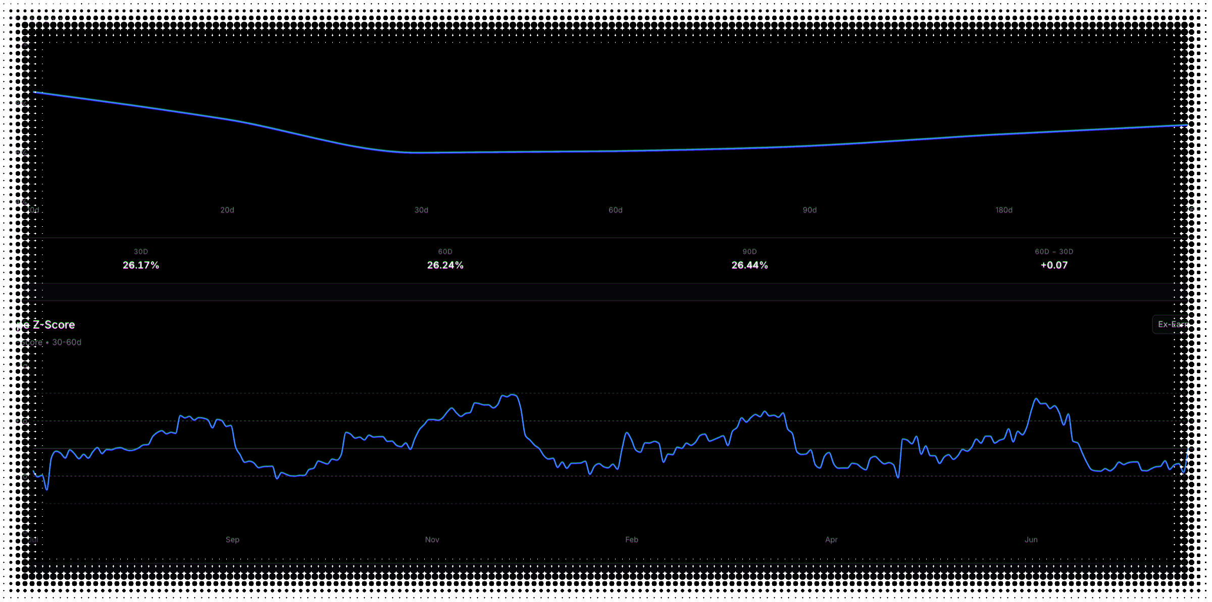
The curve
Two shapes, and they mean opposite things.
Which one you're looking at tells you when the market expects the trouble.
Contango
The ordinary shape
Longer-dated options carry more implied volatility. More time, more that can happen, nothing urgent priced in.
Inverted
When the front is bid
Near-dated options priced above the back. The market expects the trouble soon, not eventually.
Forward factor
What the market prices for the gap between two dates.
Every option spans a window. The interesting rate is the one between two of them.
The forward rate can sit below both expirations you picked. A bid front month has already absorbed most of the variance, leaving little for the window between them.
In context
Dislocated, or just Tuesday?
A forward factor only means something next to the same window's own history.
Comparison
Both bases, one chart
Standard and ex-earnings forward factors across all three windows — the one view on the tab that shows both together.
History
Rich now, or rich always?
Each window scored against five years of its own readings, so a genuinely stretched factor stands out.
Flat forward ratio
Calendars as a class
Whether calendar spreads look rich in general, rather than whether one pair of dates is dislocated.
Calculator
Price it on real expirations, not a model.
Constant-maturity tenors are built for comparison. They aren't contracts you can trade.
It’s the same signal behind the Calendar Plays preset in the options screener. For the tilt across strikes rather than the level across dates, see Volatility Skew.
Term structure FAQ
What to know about reading the volatility curve
It is the shape of implied volatility across expirations — what the market charges for a ten-day option versus a one-year option on the same stock. Normally longer-dated options price higher, because more can happen over more time. When that flips and the near-dated contracts are the expensive ones, the market is telling you it expects trouble soon rather than eventually.
Contango is the ordinary upward-sloping curve: the further out you look, the more volatility costs. Inversion is the opposite — near-dated options priced above longer-dated ones, which usually means a known event or a live stress is sitting in the front. The tab labels the current state as Contango, Inverted or Flat, and shows a dash rather than guessing when the shape cannot be determined.
It divides the front month’s implied volatility by the forward volatility implied between two expirations — the volatility the market is pricing for the window between them. Above 1, the front is priced above that forward window, which is the setup long calendar spreads are built on: sell the expensive front, buy the cheaper back. Below 1, the front is the cheaper leg. It is available over three windows: thirty to sixty days, sixty to ninety, and thirty to ninety.
Because variance is additive across time, not volatility. The variance priced into the longer option already includes everything priced into the shorter one, so the window between them only gets the difference. When the front is heavily bid, it can absorb almost all of it. A stock at forty-five percent implied over thirty days and thirty-five percent over sixty implies only about twenty-one percent for the month in between — well below both. That gap is exactly what a calendar spread is trading.
The forward factor compares the front month against one specific forward window. The flat forward ratio compares the forward volatility a flat curve would imply against the actual forward volatility. One tells you whether a particular pair of expirations is dislocated; the other tells you whether calendar spreads as a class are rich or cheap right now. The flat forward ratio is available over two windows rather than three.
It is the rate of change between two tenors — the difference in implied volatility divided by the days between them — so it captures how steep the curve is rather than just which way it leans. Four pairs are available: ten against thirty days, ten against sixty, thirty against sixty, and thirty against ninety. The slope is charted as a z-score against the past year, with reference bands at one and two standard deviations.
It puts all three windows on one chart, and for each one it shows the standard reading and the ex-earnings reading as two bars side by side against a line at 1.0. That makes the earnings distortion visible directly: where the two bars are close, a pending report is not doing much, and where they diverge, most of what looks like a dislocation is the event. It is the only chart on the tab that shows both bases at once — everywhere else you pick one.
It loads the real end-of-day option chain and lets you pick any two listed expirations — the actual contracts you would trade, not interpolated tenors. It computes at-the-money implied volatility for each, the forward volatility between them, and the resulting forward factor. If an earnings report falls inside either leg, it strips that event’s variance from the affected leg using the same extraction the nightly pipeline uses, and tells you which legs it cleaned.
It says so and stops. Crossed or stale end-of-day marks can imply a longer-dated option carrying less total variance than a shorter-dated one, which is arithmetically impossible to turn into a forward volatility. Rather than returning a number that looks plausible, the calculator reports that the pair is not computable from those marks. The same discipline applies to the earnings adjustment: where the event variance cannot be validly subtracted, it returns the raw reading unchanged rather than a fabricated one.
An upcoming earnings report inflates the expirations that contain it, which kinks the front of the term structure and can make a curve look dislocated when it is only pricing a known event. The ex-earnings view removes that event component, leaving the underlying shape. It is available on the curve, the slope and both forward-factor charts, for stocks only — ETFs do not report earnings, so the control does not appear for them.
Roughly five hundred of the most liquid US stocks, plus major ETFs — the same universe the rest of the platform analyses. Everything on this page works for both; the one exception is the ex-earnings views, which are stocks-only because ETFs do not report earnings. If a symbol is not in the universe the page says so rather than showing you a half-populated curve.
No — deliberately end-of-day. The curve, the slope and the forward-factor history are computed once the market closes. The calculator is slightly different: it reads the most recent published end-of-day chain, which arrives the following day, and it shows you the date it used rather than leaving you to guess. Term-structure dislocations are structural setups measured in days and weeks, not ticks.
Still have questions? Contact support
Find the expiration that's mispriced.
We're getting ready to launch. Join the list and you'll be first in the door.