Fundamentals
Know what you're selling options on
Two decades of financials for roughly five hundred US companies — revenue, margins, cash flow, valuation — on the same page as the volatility surface. Checking whether a company is actually growing shouldn't mean leaving your analysis.
~500 US companies · Two decades of history · Quarterly or annual
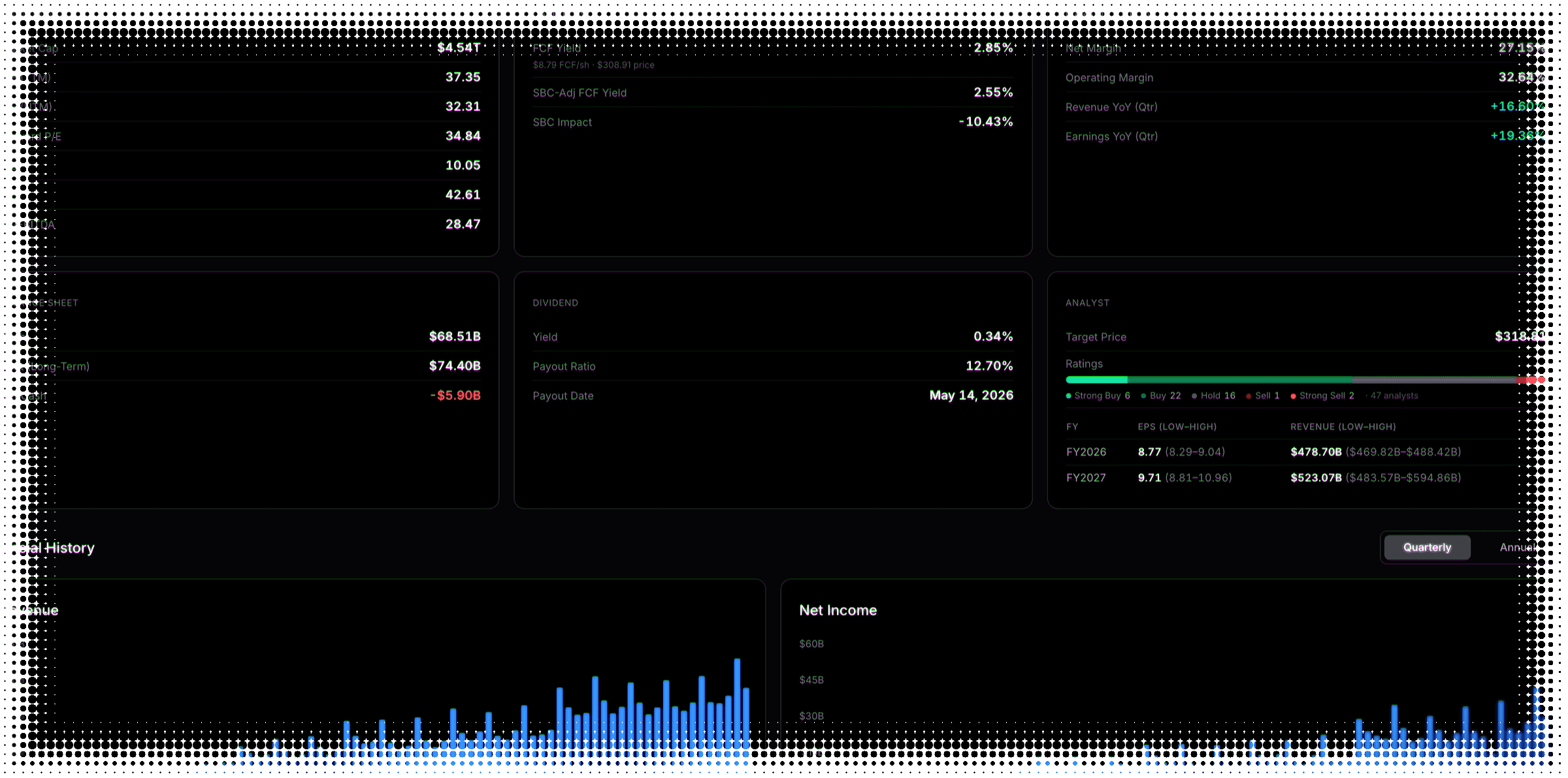
The snapshot
The whole company, at a glance
Six panels: valuation, margins, cash flow, the balance sheet, the dividend, and the analyst view.
Valuation and quality
Trailing and forward earnings multiples, sales, book and enterprise value — plus a Piotroski score that shows its own denominator.
Cash, and the quality of it
Free cash flow yield, and the same yield adjusted for stock-based compensation. Paying staff in equity flatters the first number.
What analysts expect
The price target, the full ratings distribution rather than one blended number, and estimates with the range around them.
The history
Twenty years, quarter by quarter
One toggle flips the entire grid between quarterly and annual.
A missing quarter
The line breaks
A company that lost money has no earnings multiple. The chart stops rather than drawing through the gap.
A freak quarter
The outlier is held
One extraordinary quarter is pinned at the edge instead of squashing the other twenty years flat.
The care
Where most fundamentals pages quietly mislead you
A number that doesn't apply is worse than no number, because it looks just as precise.
Enterprise multiples and cash flow yield don't mean the same thing for a lender, so for a bank the whole cash flow card comes out — rather than printing a number that looks precise and means nothing.
REITs come with a warning
Depreciation inflates a REIT’s earnings multiple and a payout above 100% is ordinary. The card says so, rather than letting you misread it.
Funds get an explanation
A fund is a basket, not an operating company. Instead of a wall of dashes it says so, and points back to the volatility views.
Same universe as the rest of the platform, so the business behind a name sits one tab from its volatility surface — and beside its earnings history.
Fundamentals FAQ
What to know about the company behind the ticker
A full financial picture for the company behind the ticker: valuation multiples, margins and growth, cash flow and the balance sheet, the dividend, and the analyst view — alongside a chart for each line of the reported history, switchable between quarterly and annual.
Because you’re selling options on a business, not a chart. The earnings move you’re pricing has a cause — margins compressing, revenue decelerating, debt climbing — and the estimates going into a report shape how far the stock can travel when it misses. Having that in the same tab strip as the volatility surface means checking it doesn’t break your analysis in half.
Roughly five hundred of the most liquid US stocks — the same universe the rest of the platform analyses. Not every stock: no international listings, no small caps, no OTC names. A handful of tickers inside that universe have no statement history yet, and rather than render an empty chart the tab says plainly that the ticker isn’t covered, which is a different message from something having gone wrong.
A median of about twenty years of annual history, and around twenty years of quarters. The very longest-standing name reaches back to 1997, though that is one company rather than the norm — most of the universe starts in the mid-2000s. Every covered company has at least eight quarters and four fiscal years, so there are no thin stubs where a chart technically renders but tells you nothing.
Two different clocks, and it matters which one you’re asking about. Valuation multiples move with price, so that snapshot refreshes daily on trading days. The financial statements behind the charts only change when a company actually reports, and then with the usual filing lag — so a fresh quarter appears within weeks of the release, not overnight.
It shows a dash, and the charts break the line rather than drawing through the gap. A trailing earnings multiple against a loss-making quarter isn’t a large number, it isn’t a number at all — so the line simply stops and picks up again when the company returns to profit. Joining those two points would draw a ratio nobody ever reported.
A bound on the axis. An extraordinary quarter — a margin swing of several thousand percent during a shutdown, say — will compress twenty years of ordinary variation into a flat line if the chart scales to it. Those readings are held at the edge of the plot instead, so the rest of the series stays legible, and the true value is still there in the tooltip.
Differently, on purpose, and in two different ways. For financial companies the metrics that don’t apply are removed outright — enterprise multiples and free cash flow yield don’t carry their usual meaning for a lender, so a bank’s page is genuinely shorter than a manufacturer’s. REITs keep everything but gain a caption explaining why their earnings multiple and payout ratio read strangely. Funds get a card explaining that a basket isn’t an operating company.
It is a nine-point checklist of financial health — profitability, leverage and efficiency, one point each. The catch is that a component sometimes can’t be computed from the available data, and scoring out of nine regardless would quietly overstate a weak result. So the score carries the denominator it was actually computed over, and a handful of companies genuinely show fewer than nine.
Because stock-based compensation is a real cost that the headline number treats generously. A company paying a large share of its people in equity looks cheaper than it is on the unadjusted yield, so the adjusted figure sits directly beside it and the gap between the two is the point. Where the adjustment can’t be computed for a company, that row shows a dash rather than falling back to the unadjusted number.
The price target, the full ratings distribution across five buckets with the count in each, and forward earnings and revenue estimates shown as an average with the range between the most and least optimistic. A range communicates disagreement in a way a single blended figure hides. Some covered names carry no estimates at all, and those simply don’t show the table.
Honestly, no — twenty years of statements for large-cap US companies is widely available, and we would rather say so than pretend otherwise. What is different is where it sits: one tab away from the volatility surface, the term structure and the earnings record for the same name, with the awkward cases handled rather than papered over. The value is not the data, it is not having to leave.
Still have questions? Contact support
See the business behind the volatility.
We're getting ready to launch. Join the list and you'll be first in the door.