Earnings Analytics
The market has priced this event before
Every earnings report going back to 2020: what the options implied, what the stock actually did, how far implied volatility fell afterward — and what selling the straddle would have returned.
Every report since 2020 · Implied vs actual · Backtested
The record
What options implied, and what actually happened.
An earnings report is the one event you can see coming — and the one with the longest paper trail.
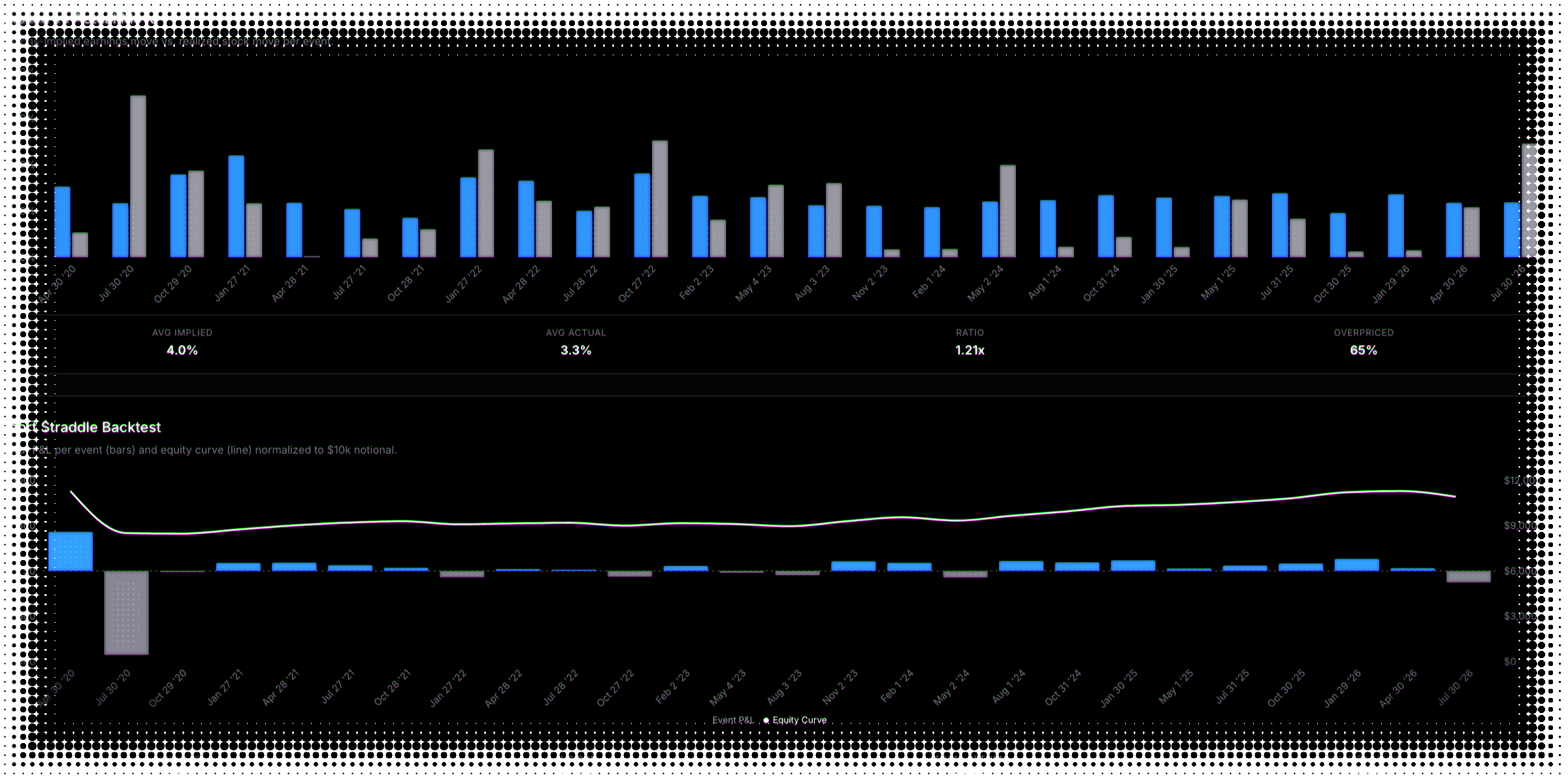
Each bar is the move the options priced for that report; each dot is where the stock actually landed. The ones that broke out are what the premium was collected for.
The backtest
And what selling it would have returned.
The trade most premium sellers are thinking about, run across every report in the stock's history.
Around the event
What else the report moved.
The volatility collapse premium sellers are paid for, and how divided opinion was going in.
IV crush
Usually, not always
How far implied volatility fell once each report cleared — including the ones where it rose instead.
Analyst dispersion
How much they disagreed
The spread of estimates going into each report, for earnings and revenue. Disagreement, not direction.
The next one
What's priced for the report ahead.
The one forward-looking number here — and it only exists once the date is close.
Nothing is drawn until a report is roughly a month out, because outside that window there is no event to isolate. From there it is tracked daily, right up to the date.
Two screens in the options screener sit on opposite sides of this trade: one for reports where the premium looks rich, one for where it looks cheap. What the company actually reported — revenue, margins, cash flow, the analyst view — sits in fundamentals, on the same page as the volatility surface.
Earnings analytics FAQ
What to know about trading around a scheduled event
Every earnings report a stock has had since 2020 — typically about twenty-five of them, though a recently listed name will have fewer — with what the options implied beforehand, how far the stock actually moved, how much implied volatility collapsed afterward, and how far apart analysts were going in. Plus what the market is currently pricing for the next report.
It is the move the options market is pricing for the upcoming report, expressed as a percentage of the stock. It is isolated from everyday volatility using a two-expiration method — the near expiry contains the event, the next one does not, and the difference is the event component. That matters because a raw thirty-day implied volatility number blends the event together with ordinary day-to-day movement, and only one of those resolves on the day.
Once a report is roughly a month out. Outside that window the two-expiration extraction has nothing meaningful to isolate, so the number simply is not shown rather than being estimated. From there it is tracked daily on the way in, which lets you see whether the market is pricing the event up or down as the date approaches.
Every past report gets both numbers side by side: what the options priced going in, and how far the stock actually moved. Alongside them sit two different summaries that are easy to confuse — a ratio of the average implied move to the average actual move, which tells you by how much options have leaned, and a separate count of how often the implied number came in higher, which tells you how consistently. A stock can lean heavily on a few reports without being consistent, or the reverse.
No, and it would be a poor assumption to trade on. Slightly over half of covered stocks have historically priced earnings moves above what they delivered, which leaves a large minority that did not. The tab is built to tell you which case a specific name is in, rather than to sell you the average. That is also why the record is shown report by report instead of collapsed into a single verdict.
The drop in thirty-day implied volatility from just before a report to just after, once the uncertainty resolves. It is measured as a relative change, so a reading of minus thirty-five percent means implied volatility fell to about two-thirds of its pre-report level — not that it fell thirty-five volatility points. It is usually a fall, which is what premium sellers are counting on, but not always: the tab keeps the reports where implied volatility rose instead, and reports the shallowest one without clamping it.
How far apart analyst estimates were heading into each report, for both earnings and revenue, alongside how many analysts were covering the name. It measures disagreement, not direction — a wide spread says the outcome was genuinely uncertain, not that it was likely to be bad. Read it as context for why an event was priced the way it was.
It runs one fixed trade across every report in the stock’s history: sell the at-the-money straddle at the close before the report, hedge the directional exposure out with stock, and close the next day. Every past event gets a bar, and a running total sits above them. It is not configurable — you cannot change the strikes, the timing or the hedge.
Carefully, and as a description of the past rather than an expectation. It is frictionless: no commissions, no slippage, no bid-ask spread, all of which fall on the same side and all of which matter for a trade that opens and closes within a day. The dollar figure is a normalization — each report’s return is applied to a constant ten thousand, then summed — so it is not an account balance and it does not compound. And a short straddle’s loss is not capped, so a long run of small wins can be undone by one report.
Because it counts outcomes without weighing them. Selling premium into events wins often and loses big, so a high win rate is the expected shape of the strategy rather than evidence that it works. Note too that the win rate and the headline average return are computed on different bases — one on the notional, the other on the premium collected — so they answer related but distinct questions and should not be read as one number.
Roughly five hundred of the most liquid US stocks — the same universe the rest of the platform analyses. ETFs do not report earnings, so the tab shows a single line explaining that rather than an empty set of charts. Where a particular figure is missing for a particular report, it is shown as a dash rather than a zero; nothing on this tab is filled in with a placeholder number.
No — end-of-day. Earnings history changes once per report and the forward-looking implied move updates daily, so there is nothing here that a live feed would improve. Scheduled dates can shift, and ones the company has not confirmed are marked as estimates rather than presented as fixed.
Still have questions? Contact support
See how the last reports actually went.
We're getting ready to launch. Join the list and you'll be first in the door.